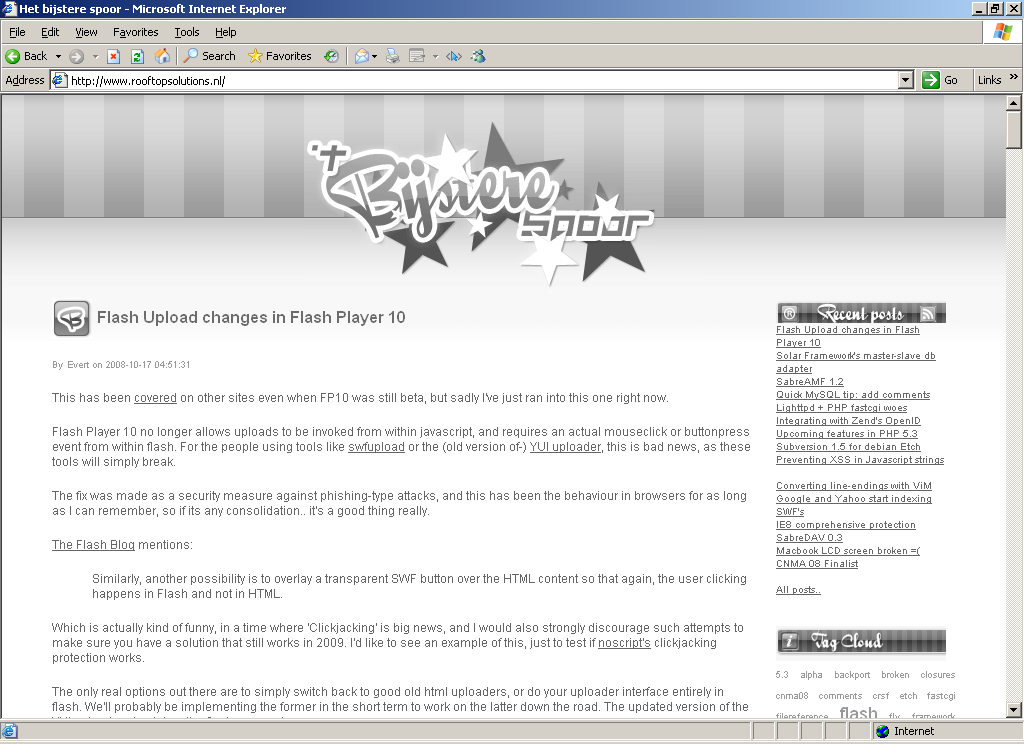
New on this blog: degraded experience for IE6
A list apart was probably one of the first feeds I added to my RSS reader, and up until this day I enjoy reading the high quality articles.
Just last Tuesday they published an article around progressive enhancement with css, which covered a rather funny example from Andy Clarke's site, which is completely black and white in IE6, along with modified low-fi images.
I couldn't resist doing this myself as well, so if you hit this site using IE6 now this is how it will look like:
The code:
<!--[if lte IE 6]>
  <style type="text/css"> body { filter: gray(); } </style>
<![endif]-->

Comments
Dougal Matthews •
lol, thats awesome. I'd do the same if mine wasn't almost totally colourles already.app •
Now why would you do that? That's just being mean & spiteful.Why not do something useful for those people that have old slow computers that can't upgrade to anything beyond IE6 and maybe help them out by pointing them in the direction of K-Meleon, the only modern safe secure browser that is still actively developed and supports old OS's & machines with low ram & slow CPU's?
It's bad enough poor people have been abandoned by most developers. They don't need webmasters playing spiteful jokes on them, too, just because they can't afford to buy a new computer.
Evert •
Hi App,Considering my target audience (developers!), I think I'll be fine.. Off-topic, if you run a microsoft operating system that doesn't support IE7 today I'd be more worried about security than a degraded browsing experience.
Freelance •
yep funny, but ill not use this on a pro website, let users doing choices and give them arguments not funny things, dont force'm !!!Evert •
I agree =) can't use this for commercial websites.. Here I can just use it as a statement (of frustration?) though :)