Browser tabs are probably the wrong metaphor
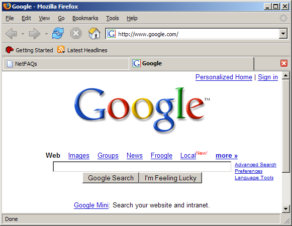
Back when Internet Explorer was dominant, and every developer I knew installed Firefox on every family member and their dogs desktop, I remember a big selling point for convincing people to use Firefox was ‘Tabs’.
Firefox may not have been the first browser to introduce tabs, but in my experience it was the number one selling point to get people to switch. Especially those that otherwise didn’t care about Internet Explorer being dominant and stagnating the web.

Since then, pretty much every desktop browser has adopted the same basic UI only mild variations.
One thing that kind of interests me is that every now and then I spot someone with a ridiculous number of tabs open. On Firefox this is still somewhat managable, because tabs don’t shrink below a certain size, but show arrows on each side to scroll through them, along with a menu.

On Chrome though, having a lot of tabs open makes it become completely unusable.

The surprising thing to me is that I see this a lot on family members’ and friends’ screens.
When I would see this at first, I admit I may have made a little fun of people. Maybe commenting on their poor organizational skills, but I soon realized this pattern was common enough that it’s hard to blame the user, and I’ve started to feel that for many (if not most) browser users, the tab is just a bad UI.
When interviewing people with a ton of tabs on their screen and asking them why, the most common responses can be somewhat categorized as:
- I need to get back to that tab later.
- I just keep opening new tabs and forget about the old ones.
When asking the first group for more information, I realized that a lot of people use tabs as a sort of bookmark. Something to get back to later. One person I talked to was afraid for restarting their computer, because of the risk of not being able to get back to their open tabs.
I tend to use tabs for ‘currently active work’ and tend to keep them somewhat organized, and I’m sure there are plenty of people like myself. But for all the people that accumulate hundreds of tabs, I feels like the time is right for a better paradigm that combines bookmarks, tabs and history.
Perhaps organizing sessions in interactive timelines and grouping things together based on the user’s behavior might be a better approach. I believe that anything that requires active management and organizing would probably not work though. I don’t think I would remove the tab altogether, but just show me the last few things, treat them as emphemeral and provide an option to explore my current and previous session(s).
I’m sure experiments are out there, but so far it doesn’t seem like major browser vendors have had the guts to release something new. This is a bit surprising to me because despite the fact that competition is fierce and users tend to have strong opinions, everyone seems to be doing very similar things and converge on Chrome.
Perhaps part of the issue is that everyone just wants to cater to the largest possible audience, making everyone risk averse.
Anyway, this is all speculation with no data from a non-expert. Curious what your thoughts are, or if you know of any experiments that solve this problem.
Wanna respond? Reply to this tweet